Watt’s Up Electric
PROJECT DETAILS
COMPANY: Watt’s Up Electric
INDUSTRY: Electrical Contracting
DELIVERABLES: Website, Proposal Template, Business Cards, Email Signature
WEBSITE: wattsup-electric.com
Before I get into detail, I need to acknowledge how awesome this company’s name is: Watt’s Up Electric. Amazing, right! Get it, like “what’s up,” but “watts” because, relevance. Get it? Love it!
Okay, okay. So this company, like it’s name, is very personable & casual. They provide their services local-style. This crew is knowledgable, safe, and doesn’t believe in fast/half-ass jobs. They focus on quality & safety because they serve their own local community. So everyone is a friend or family! I wanted to highlight that fun, professional, & straight-forward personality in this project (mostly in the website).
BRAND DELIVERABLES
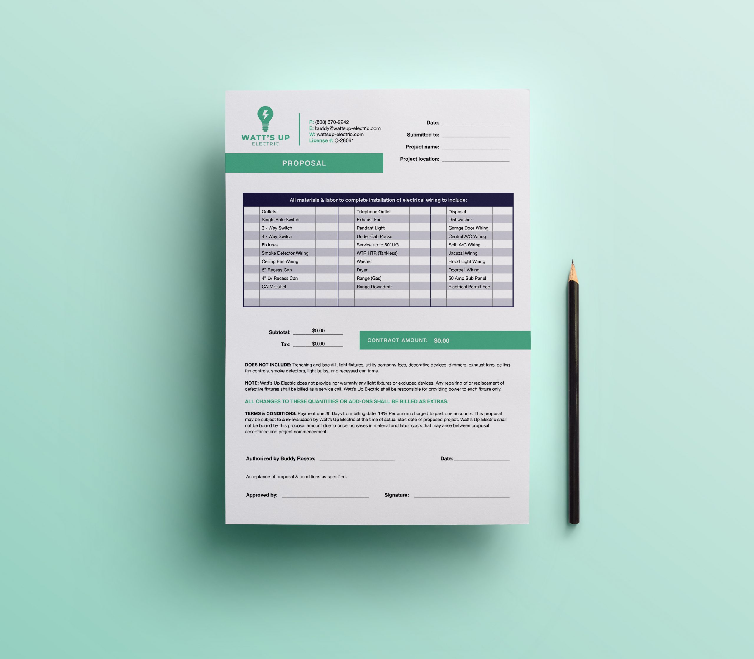
PROPOSAL TEMPLATE
Not only do proposals lay out project plans & details, but they can also make an impression on setting expectations for service quality. This design is clear & easy to read/look at. The document itself auto-calculates price & quantity for accurate totals – and ease when building a quote.
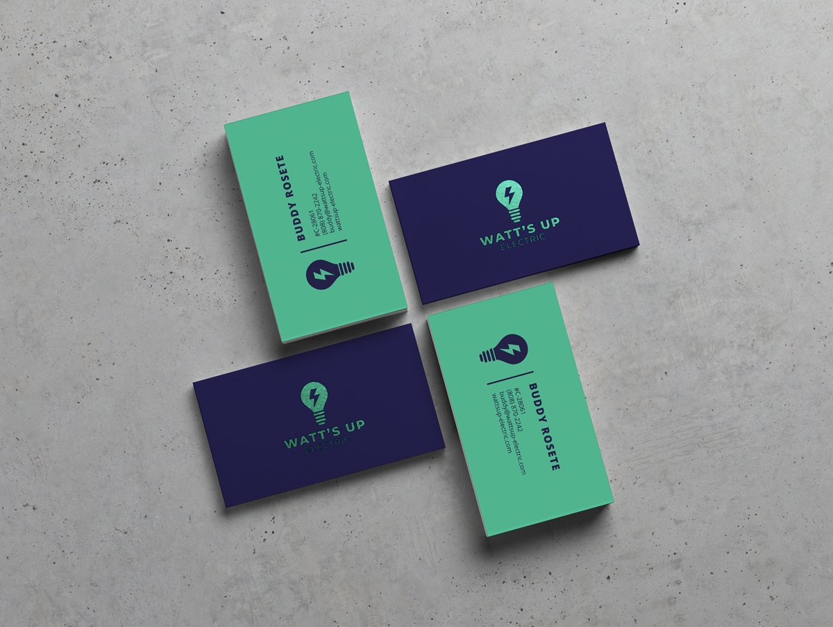
BUSINESS CARDS
The business cards are clean & simple. The frontside features the logo with a metallic green finish. The backside of the card with contact information flips the colors with green background & purple details.


ILLUSTRATIONS
The graphic elements visually demonstrate the service without using photos. It also adds some fun & color, bringing personality to the site.
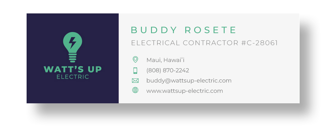
EMAIL SIGNATURE
Email signature is responsive, displaying appropriately on different screen sizes.

WEBSITE
The website is super simple as well. Text & graphics enter with scroll animation. Animated number counters are used to highlight & bring attention to information. As mentioned, the graphic illustrations are used to demonstrate the service. The only photography used show electrical items. We also shared some information on electrical dangers & safety.
