MOKUPUNI PARTNERS HAWAIʻI
PROJECT DETAILS
COMPANY: Mokupuni Partners Hawaiʻi
Owner, Kayla Shaw
INDUSTRY: Real Estate – Residential
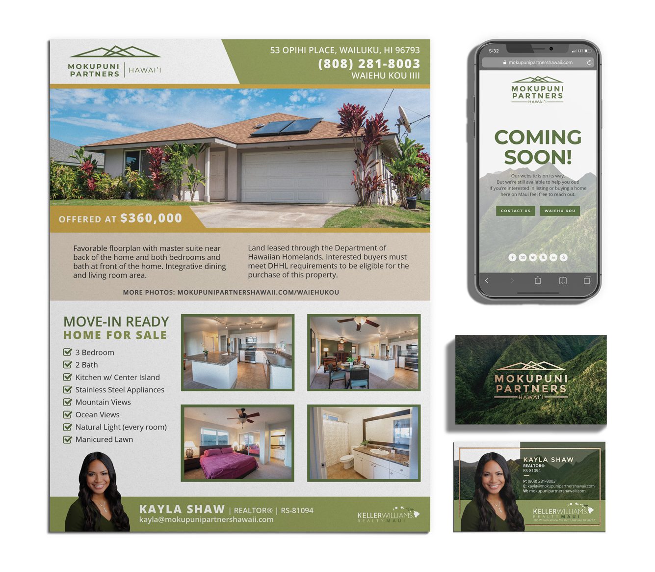
BRAND ITEMS: Brand Identity (colors, logos, etc.), business cards (2 sets), website*, property flyer, social media assets, email signature, buyers & sellers presentations*, directional signs (A-frame), yard signs (w/ riders), mailers*
*Still pending completion
BRAND IDENTITY
“MOKUPUNI”
Noun, (mō’-kŭ-pū’-ni)
Ex: Maui, Molokaʻi, Lanaʻi
Moku = island, division, section / Puni = surround. The full form for island; that is, a division of land surrounded (by water).
LOGOS
Since the company is based on Maui, our logo was inspired by Mauna Kahalawai (West Maui Mountains). Geometry visually communicates shape, position, & arrange space. It is found in nature, used frequently in cultural design, & relied on for construction.
Three logo variations were created for various needs. We have a primary logo, secondary logo, & submark/icon logo. Different situations or usage will call for a particular orientation, size, or detail. It’s important to have these options available.



COLOR PALETTE
BUSINESS CARDS
IMAGE: West Maui Mountains, Mauna Kahalawai
(Kayla has familial roots connected with this mauna)
ELEMENTS: Logo, her name, & border details were printed in gold foil.
DETAILS: All Kayla’s contact info & professional credentials listed


REAL ESTATE SIGNS
DIRECTIONAL SIGNS
As the name suggests, these signs provide directions to the open house location. They are double-sided/A-frame signs to be positioned near roadway turns, guiding drivers through streets.

YARD SIGNS
For Sale signs include replaceable top riders: “for sale, sold, & do not disturb occupant.”

DIGITAL ELEMENTS
SOCIAL MEDIA ASSETS
A few assets were made in varying sizes for social media profiles. The icon logo was used as a profile picture. The mountain range image was used for cover photos & backgrounds. A branded “coming soon” post was also created.

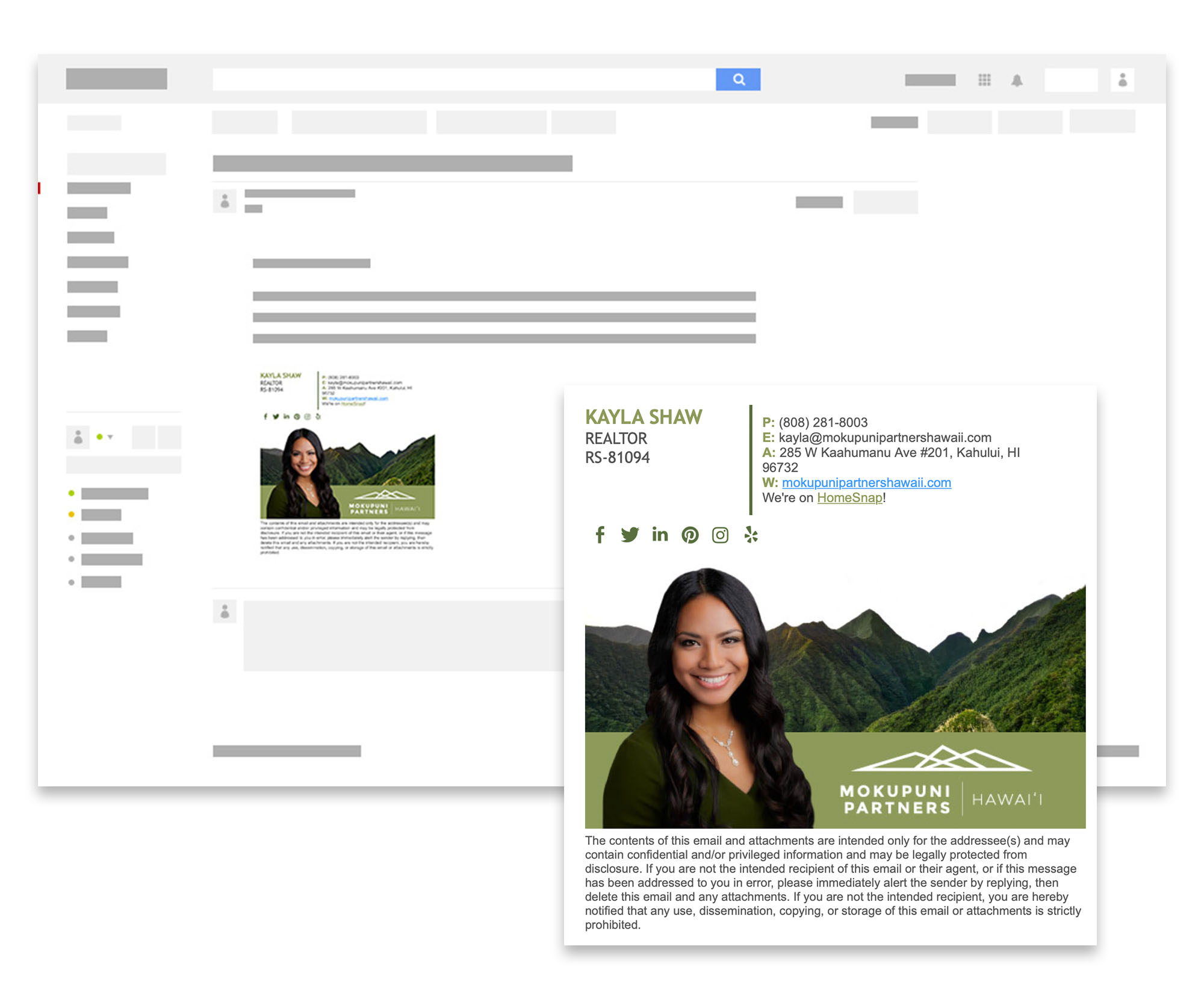
EMAIL SIGNATURE
To stand out & make an impression, we went big! Making sure we put a face to a name. Information includes: logos, realtor credentials, social media accounts, contact info, & a disclaimer.
